
Potamkin Companies
Potamkin approached us to develop a brand architecture and creative strategy for a number of entities including brand positioning and visual identities for Potamkin Development, specializing in automotive and industrial real estate, Potamkin Philanthropies, which is committed to supporting social, educational, and scientific initiatives that benefit the communities they serve, The Potamkin Prize, an annual award celebrating Alzheimer’s research, and the parent firm, Potamkin Companies.
All entities address different audiences and provide distinctly different services, yet, all carry the family name and a generational tradition of raising up communities through enterprise, innovation, and humanitarianism. Our research-driven process resulted in solutions that are distinct from one another, address each venture’s mission, purpose, and audience, and yet reflect a brand ethos that unites them.
Working closely with Potamkin Companies leadership, we strategized about the effectiveness of a more robust identity system that could define all existing and future Potamkin companies. By leveraging the Potamkin name as a brand device and streamlining the identity system, the resulting impression is an unity of individual strengths — the perfect metaphor for a family — better together.
the potamkin prize identity
brand positioning, strategy, concept, design
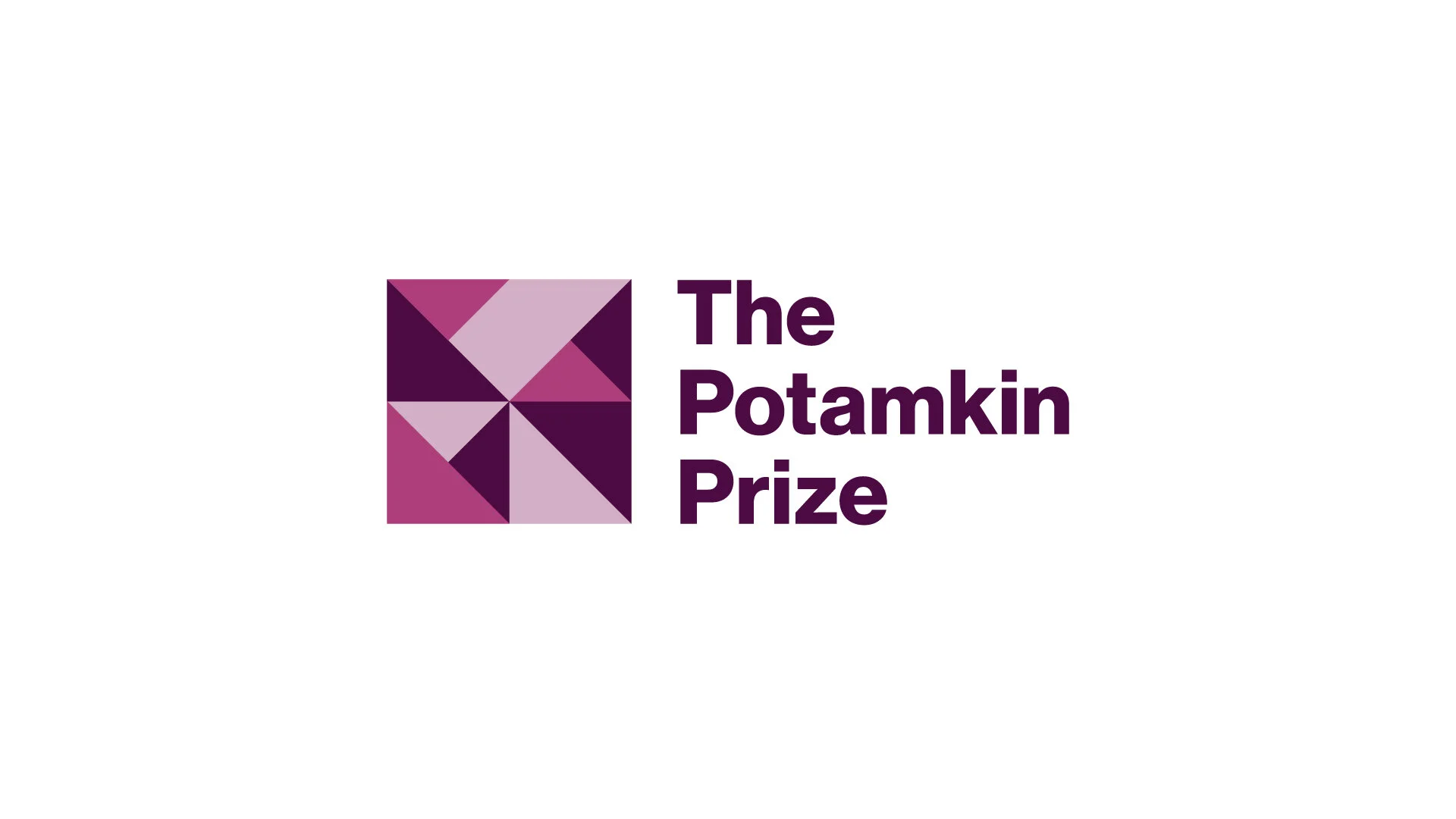
Often called the “Nobel Prize of Alzheimer's research,” The Potamkin Prize recognizes the achievements of scientific researchers in the study of Pick’s, Alzheimer’s and related brain degenerative diseases. The award was first established in 1988 in honor of Luba Potamkin, who was diagnosed with Pick’s a decade earlier. The annual award consists of $100,000, an emblematic medallion, and opportunities to share research and findings with the scientific community.
The Potamkin Prize logo reflects the complex and multifaceted nature of the research it celebrates, as well the beauty and grace that persists despite the debilitating effects of these diseases. It has been said that Alzheimers and Dementia might be seen as impossible puzzles to the individuals that live with these diseases, and the researchers who are trying to find a cure. Formally the logomark references a puzzle, but one with technically many solutions (and therefore) no longer impossible. In this way the logomark symbolizes hope and the potential for scientific breakthroughs. The color purple, often used to represent Alzheimers, is a predominant element in the overall brand.


The potamkin prize website
visit site: potamkinprize.org
strategy, content, concept, design, development
The Potamkin Prize website has won a 2020 American Web Design Award from GDUSA
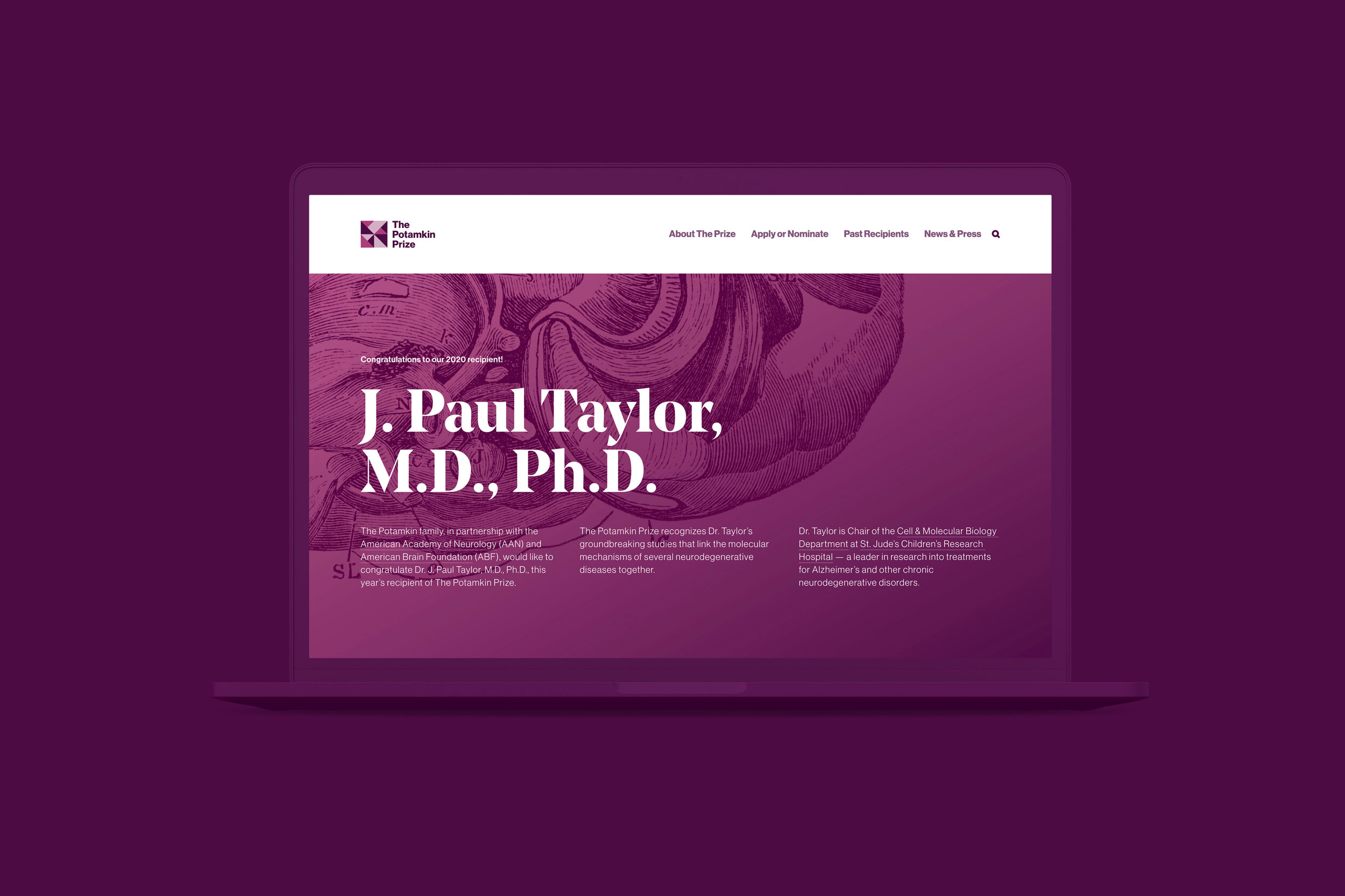
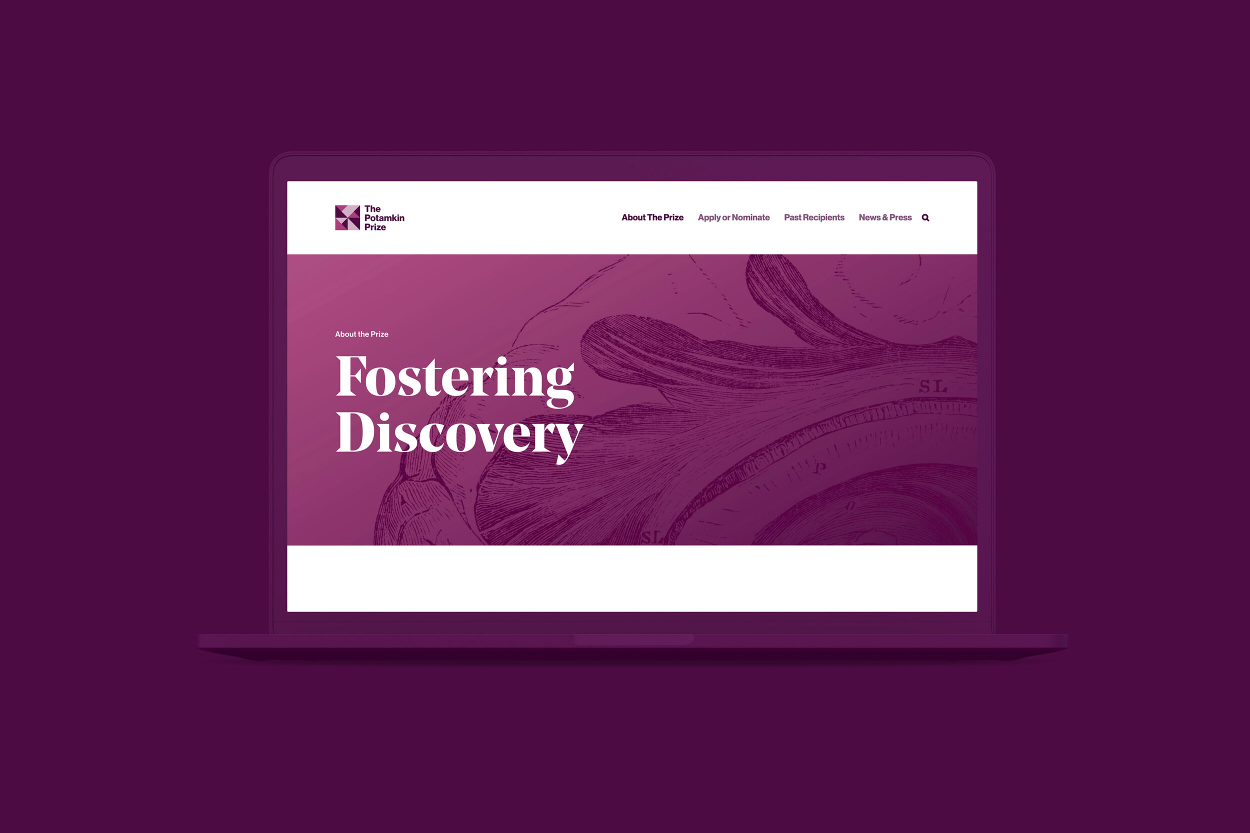
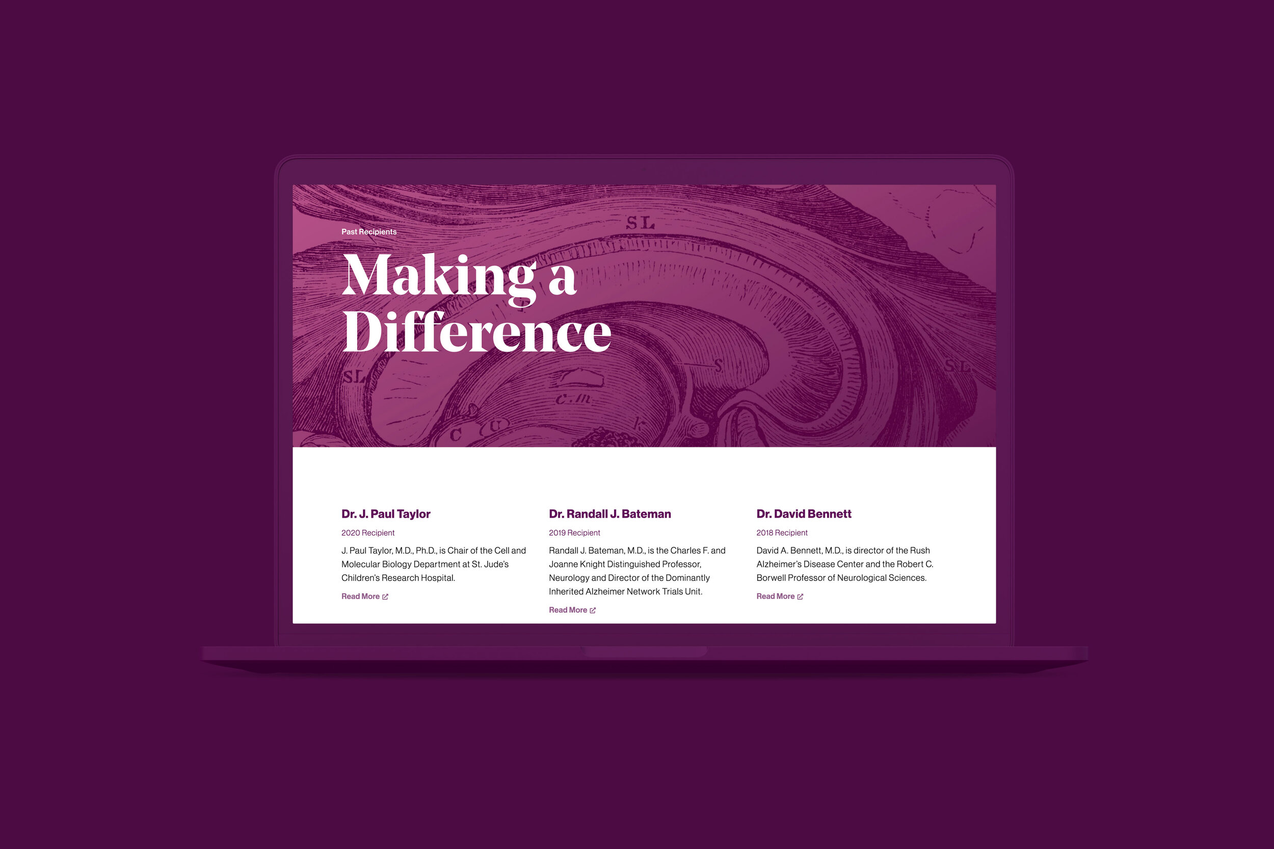
After nearly four decades of dedication to recognizing the most innovative research in Pick’s, Alzheimer’s and related brain degenerative diseases, The Potamkin Prize now has a platform that expresses the organization’s mission, history, and steadfast devotion to supporting the research of brain degenerative diseases. The website not only celebrates each year’s recipient, but serves as a catalog of all past awardees with links to their research and discoveries going back to its first awardee in 1988. The prize has bestowed more than $3 million to almost seventy researchers, making a profound impact on the research of and advancements in degenerative diseases.
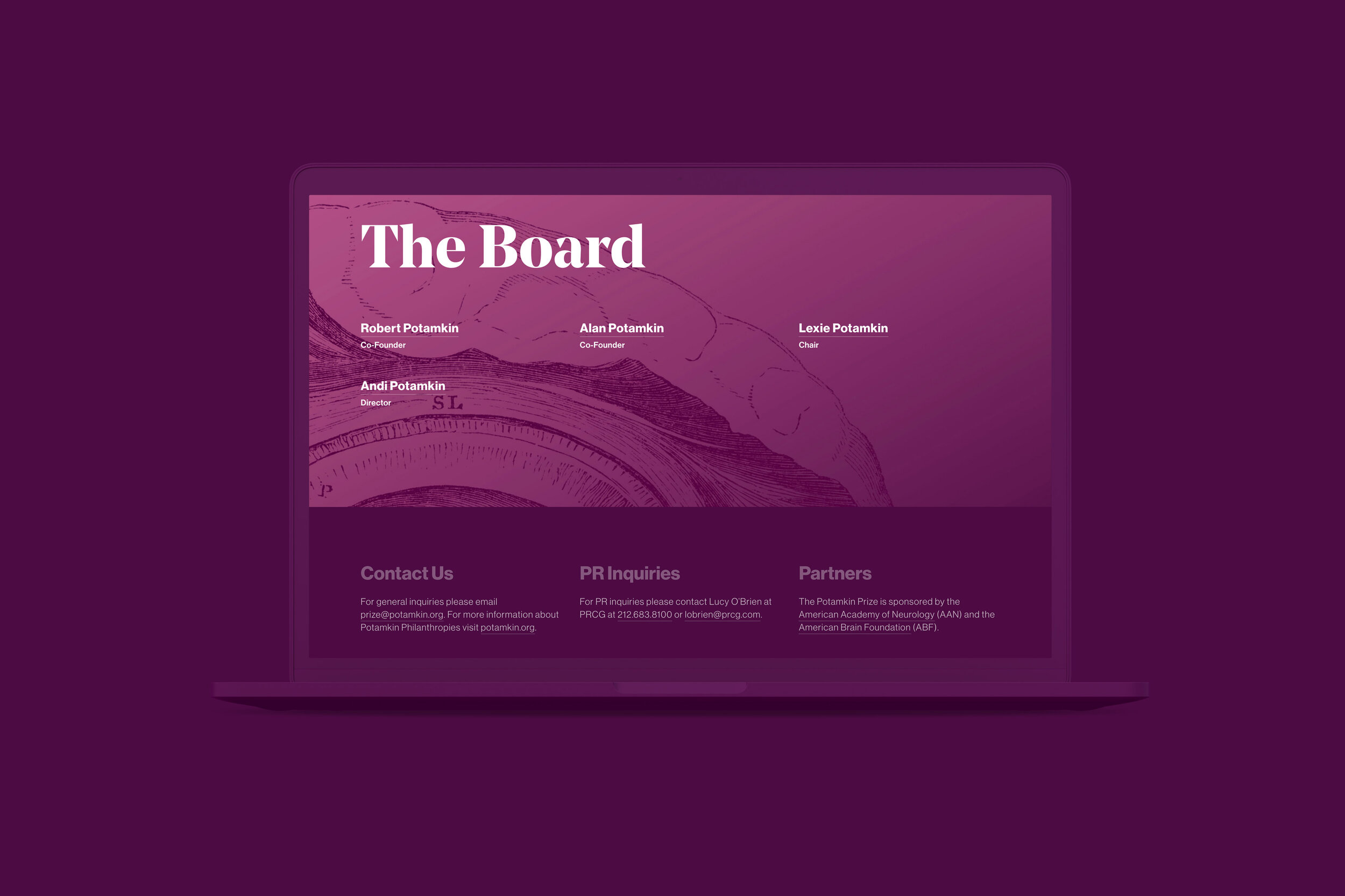
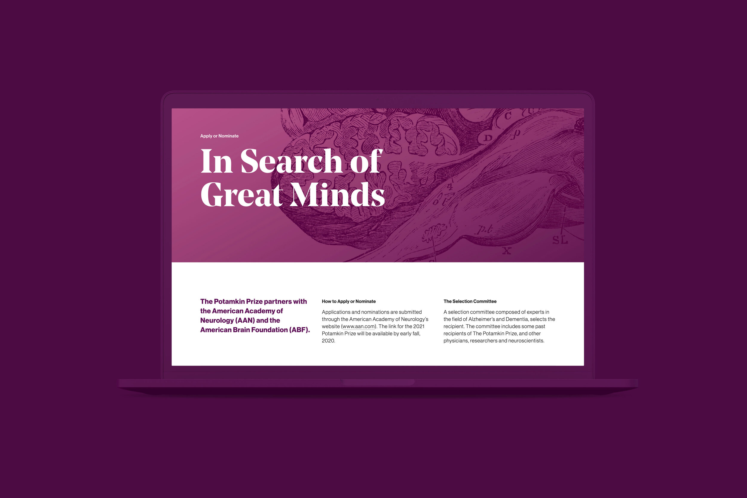
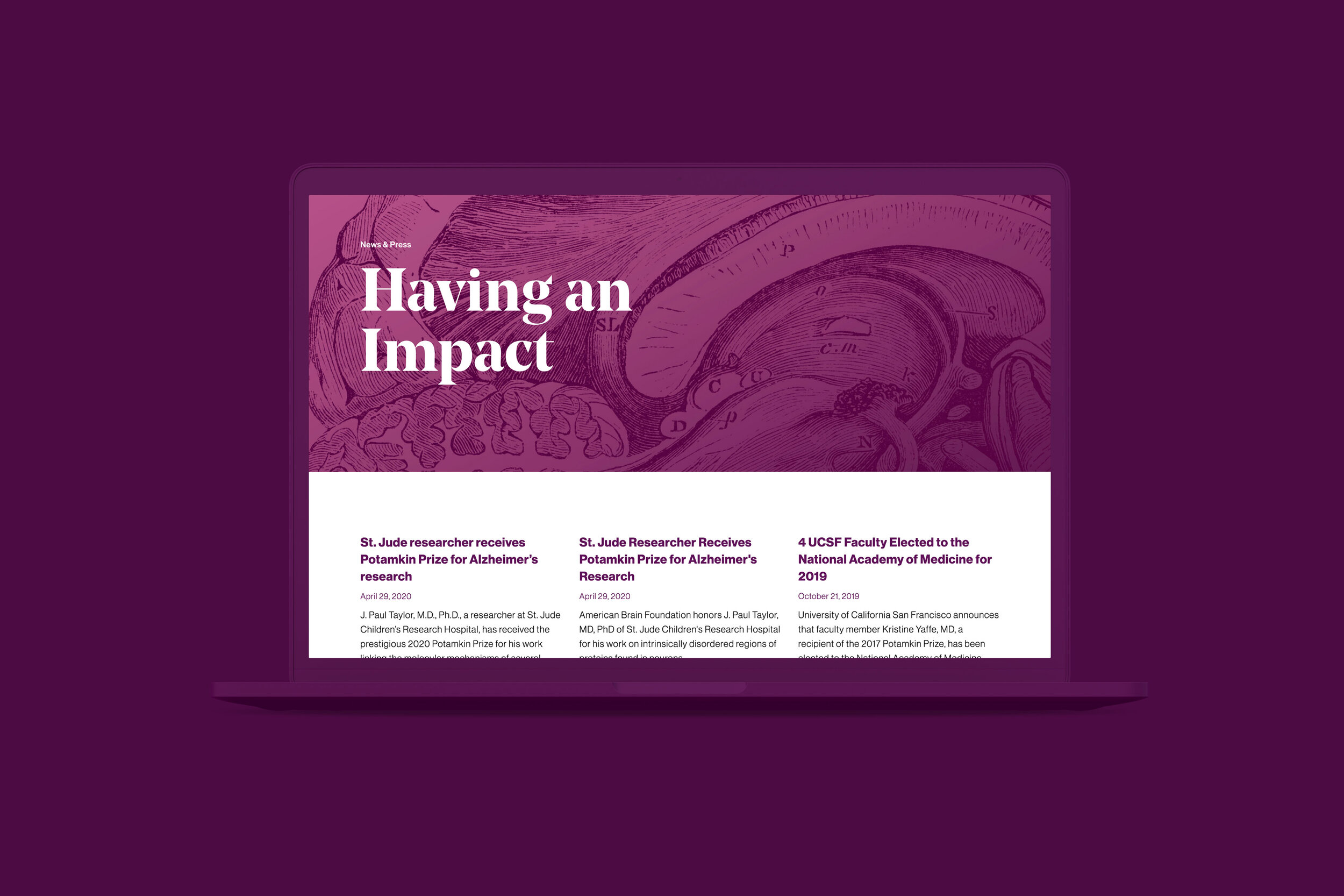
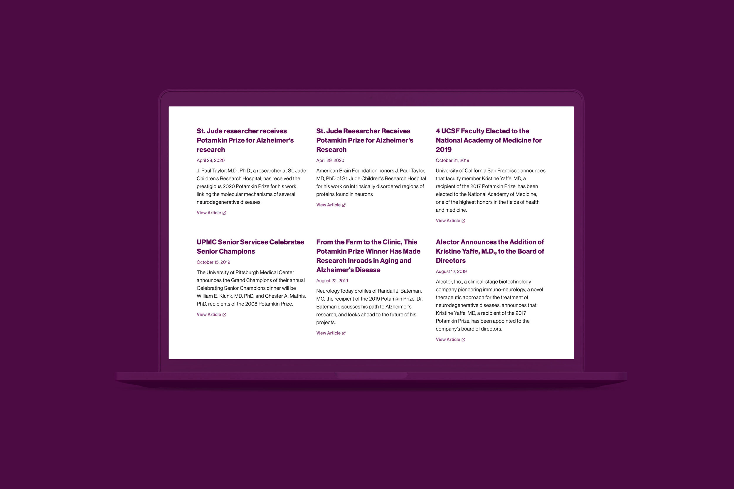
Visitors of potamkinprize.org can also rely on the website for announcements, updates, and information about the application and nomination process for interested parties. Each year, the website features the Commitment to Cures gala, an event to celebrate brain research, build relationships, and support the neurological community. At the gala The Potamkin Prize is officially presented, in partnership with the American Academy of Neurology (AAN) and the American Brain Foundation (ABF).
The potamkin prize stationery
concept, design, print management
Business cards, printed and digital letterhead, envelope, and email signatures featuring The Potamkin Prize branding are simple and straightforward as part of a larger system of various Potamkin-branded print and digital collateral.
Working within that system, each individual brand stands on its own while also serving a larger communication goal under the Potamkin family name — familiar branding across media and across companies.


The potamkin prize social media
strategy, content, concept, design
Image and gallery post templates for instagram were created for the in-house team to utilize and post as needed. Post types included general marketing (company and scientific facts, quotes, research, recipient shout-outs, etc.) and time-based marketing (announcements, events, etc.). Additional video post templates were created as well.
All posts incorporate branded typography and colorways specific to the visual identity. Illustrations/diagrams of the brain are cropped in a manner that can potentially connect when side-by-side to add interest to the account page.
Potamkin Development IDENTITY
brand positioning, strategy, concept, design
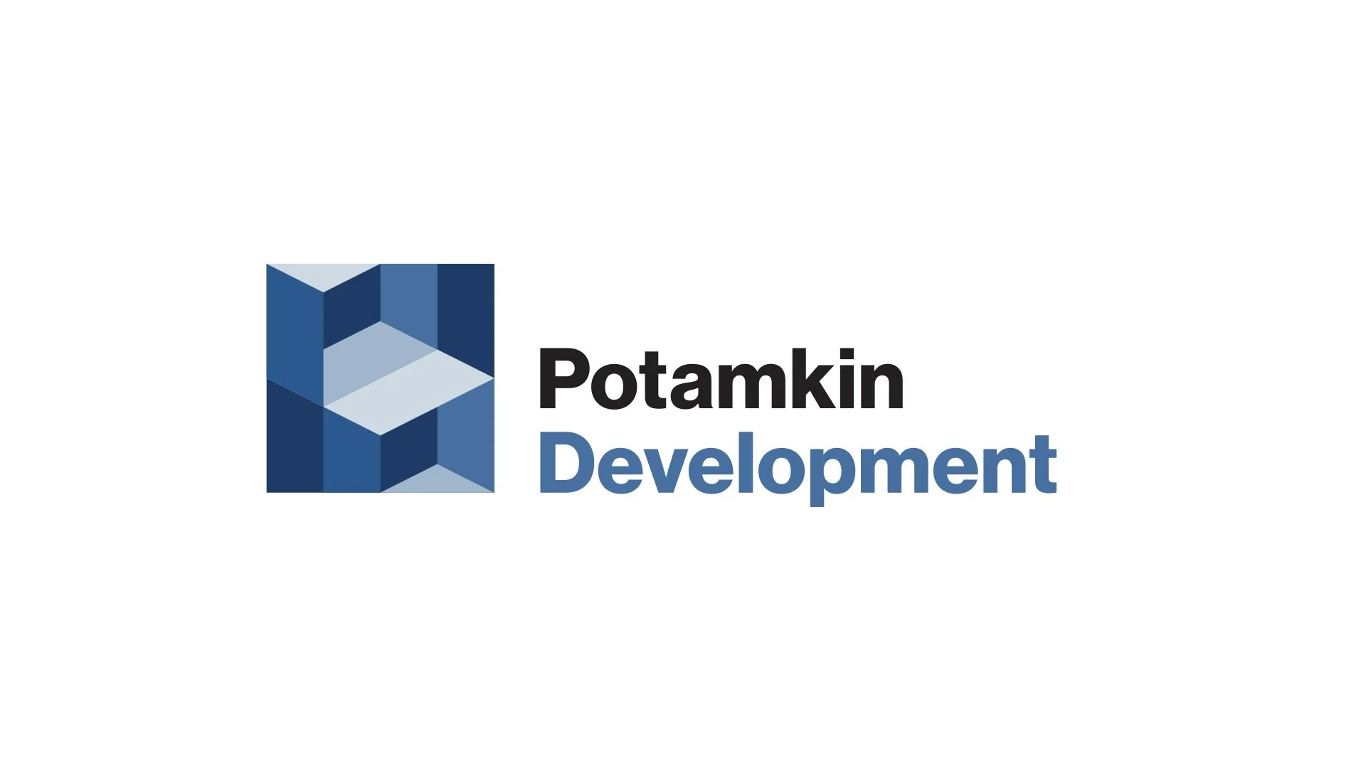
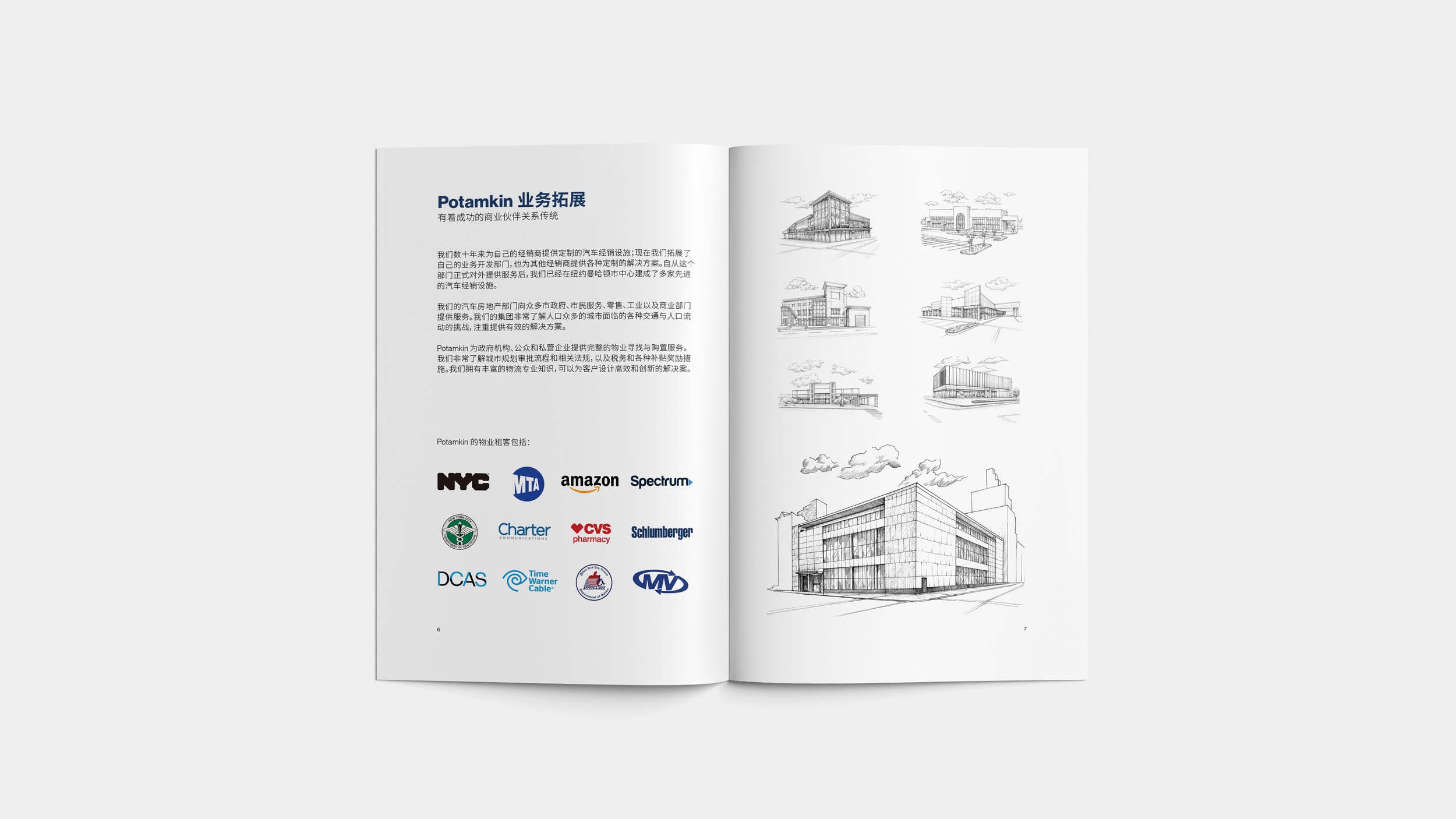
Servicing national companies and municipality fleets, Potamkin Development provides custom automotive storage and maintenance facilities through logistical expertise, innovation and dedication to the fleet of the future.
The Potamkin Development logo is an abstract representation of the companies’ innovative services. References to storage and structures are elaborated upon by suggestions of an in the box and out of the box approach indicative of their highly customized products and services.


potamkin Development website
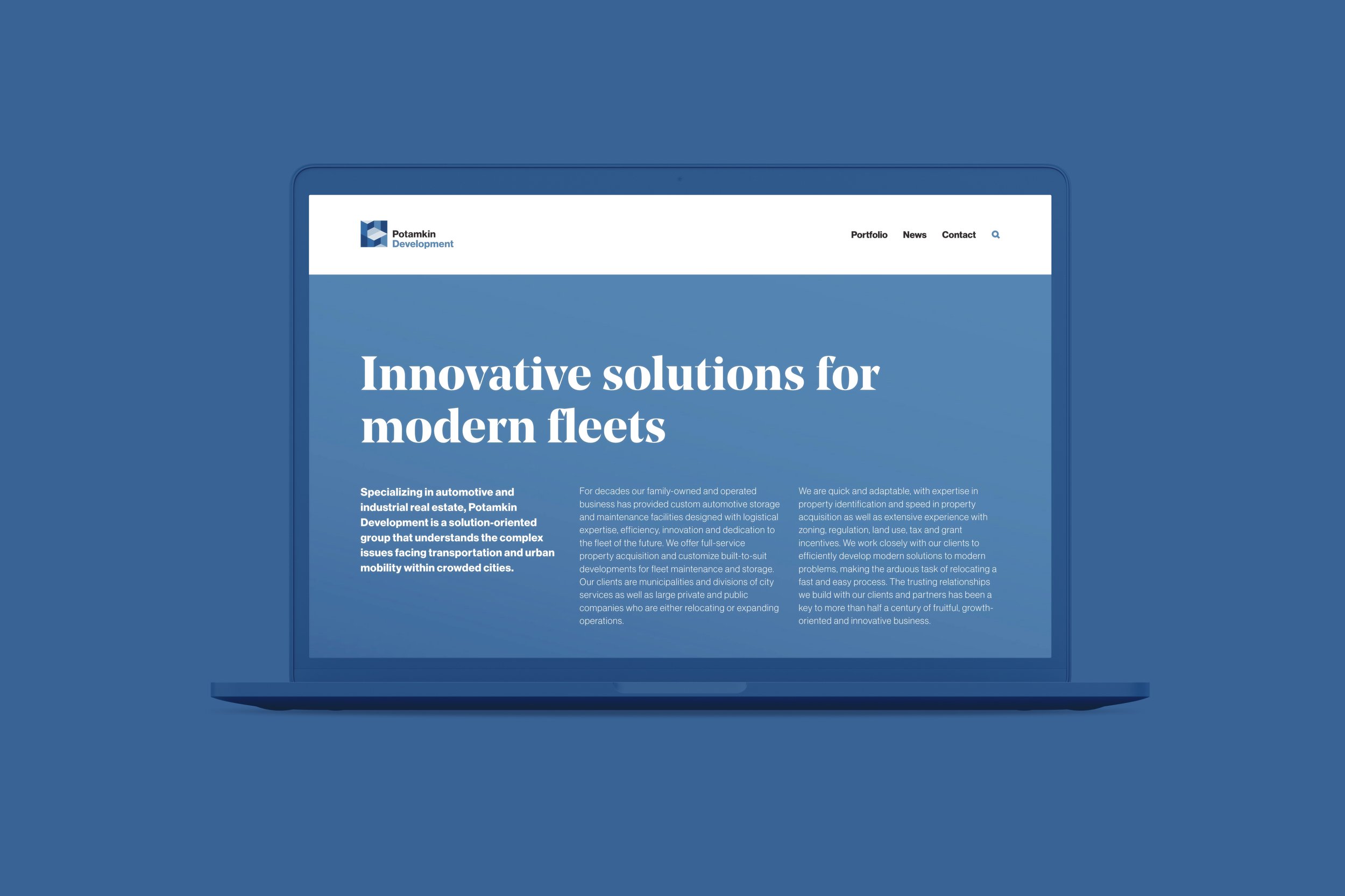
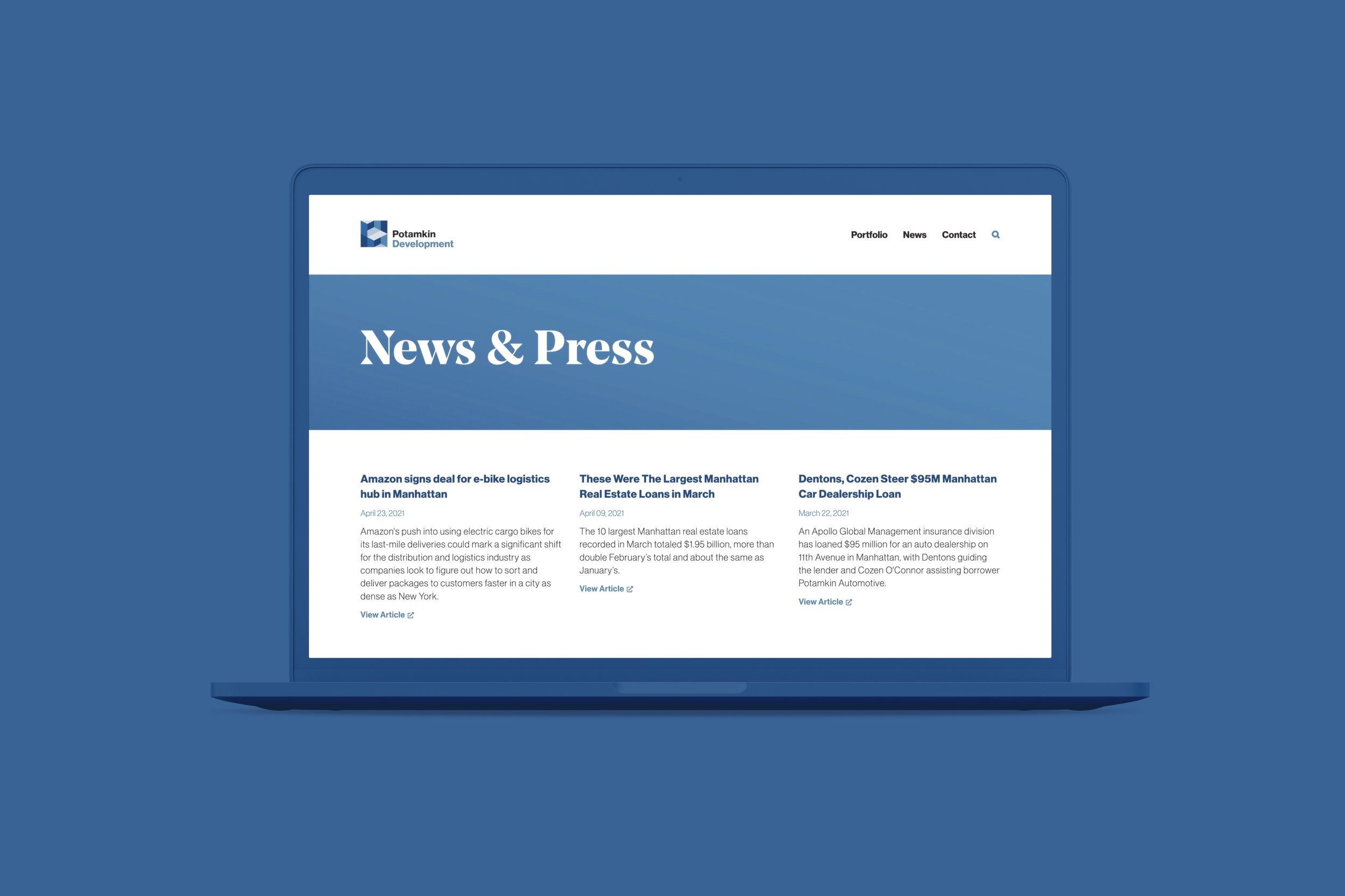
visit site: potamkindev.com
strategy, content, concept, design, development
Potamkin Development is a solution-oriented group dedicated to the fleet of the future — providing custom automotive storage and maintenance facilities designed with logistical expertise, efficiency, innovation, and a deep understanding of the complex issues facing transportation and urban mobility within crowded cities.
Visitors of the site can view up-to-date company news and press, view a portfolio of work, learn more about services and offerings, and make inquiries as appropriate.
potamkin development stationery
concept, design, print management
Business cards, printed and digital letterhead, envelope, and email signatures featuring Potamkin Development branding are simple and straightforward as part of a larger system of various Potamkin-branded print and digital collateral.
Working within that system, each individual brand stands on its own while also serving a larger communication goal under the Potamkin family name — familiar branding across media and across companies.

potamkin DEVELOPMENT
brochure
concept, design, print management
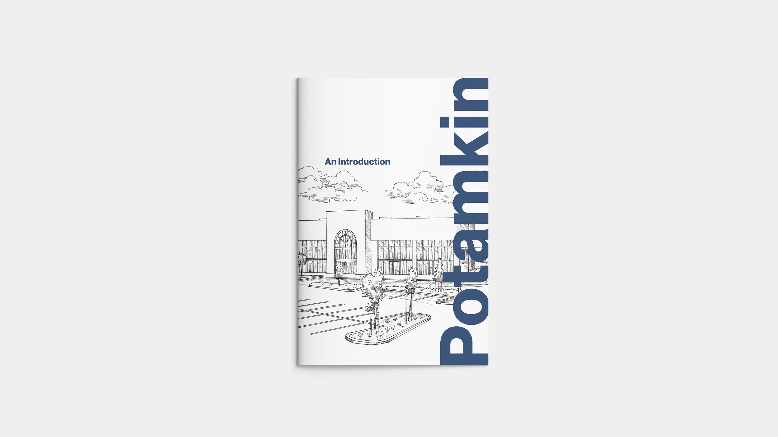
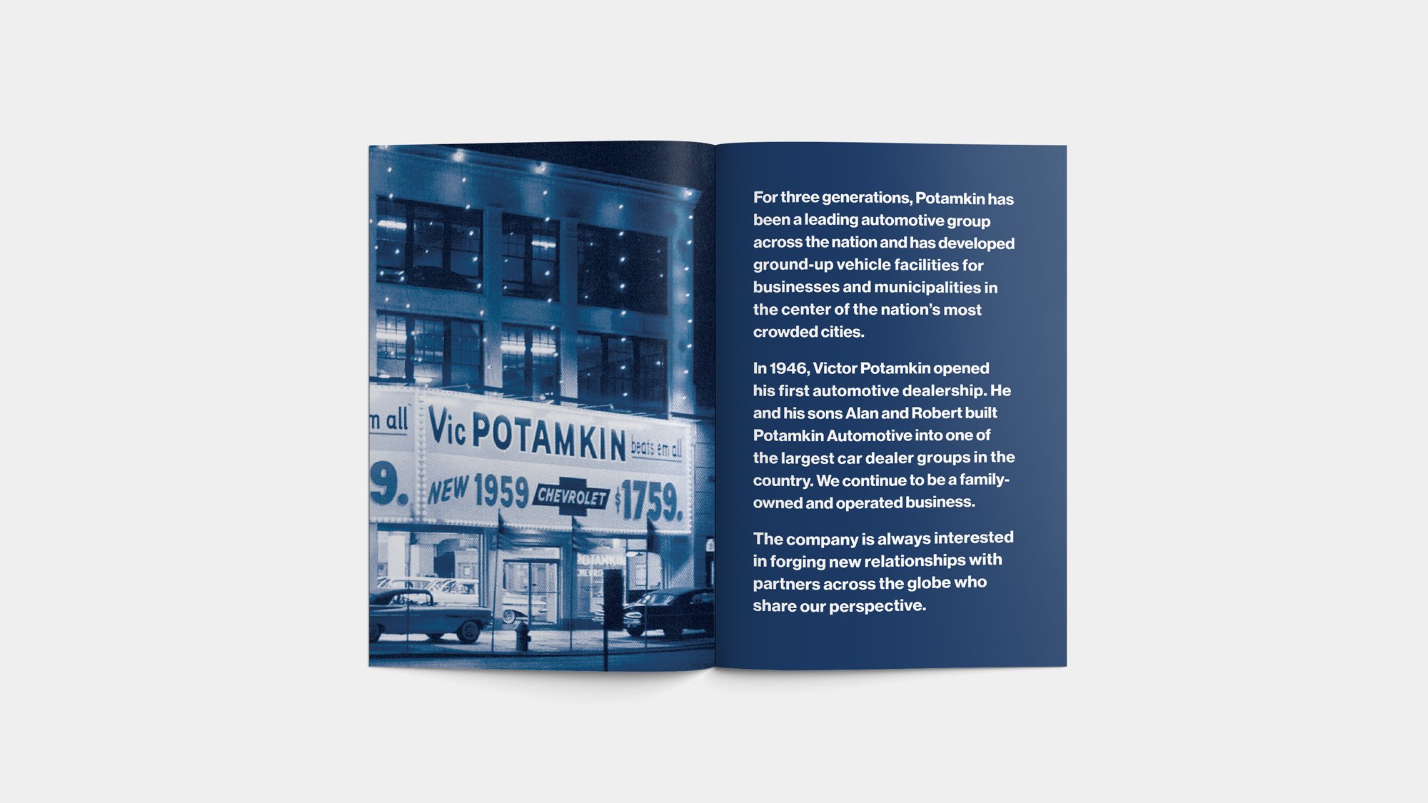
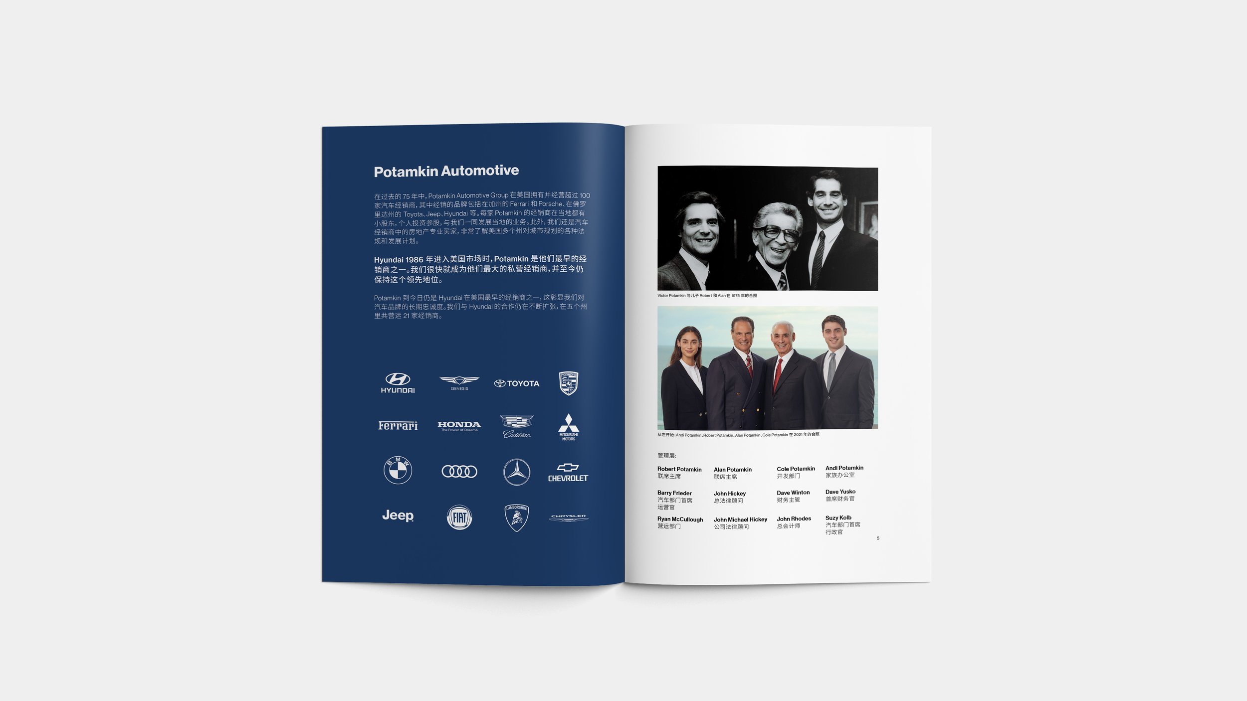
Offered initially in English and Chinese languages, this brochure was created to market Potamkin expertise and services to automotive companies overseas looking to expand and grow in the US.
Providing information about the family legacy and an overview of Potamkin companies and their respective clientele, the brochure serves as a friendly introduction to potential overseas clients.

Potamkin Philanthropies IDENTITY
brand positioning, strategy, concept, design
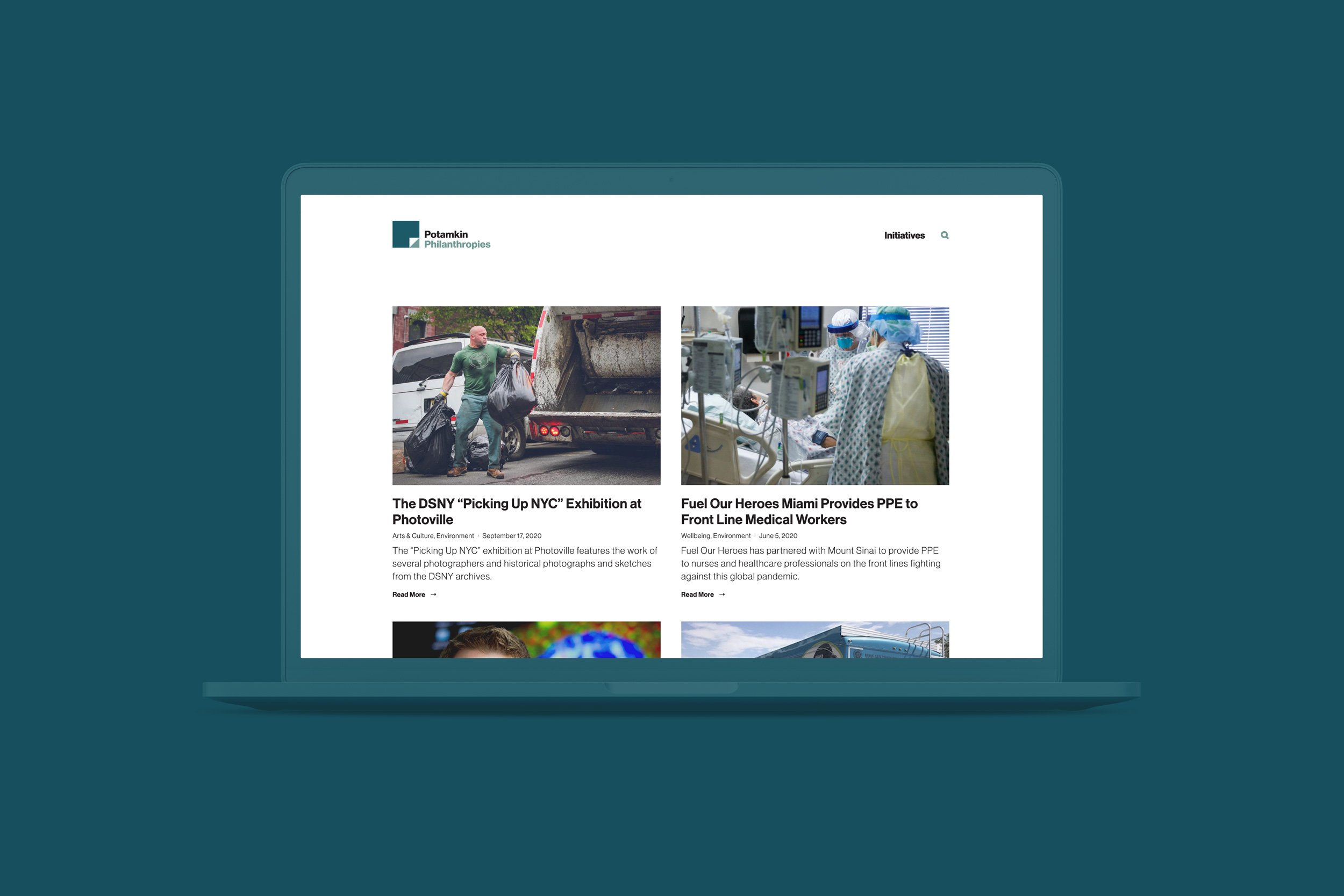
Potamkin Philanthropies support and empower social, educational, and scientific initiatives that benefit the quality of life in the communities that they serve. These initiatives range from animal welfare and advocacy to brain research and medical equipment to spiritual and cultural work.
The Potamkin Philanthropies logo utilizes the iconography of a page turn revealing brighter opportunities and new found empowerment experienced by its beneficiaries.


potamkin Philanthropies WEBSITE
visit site: potamkin.org
strategy, content, concept, design, development
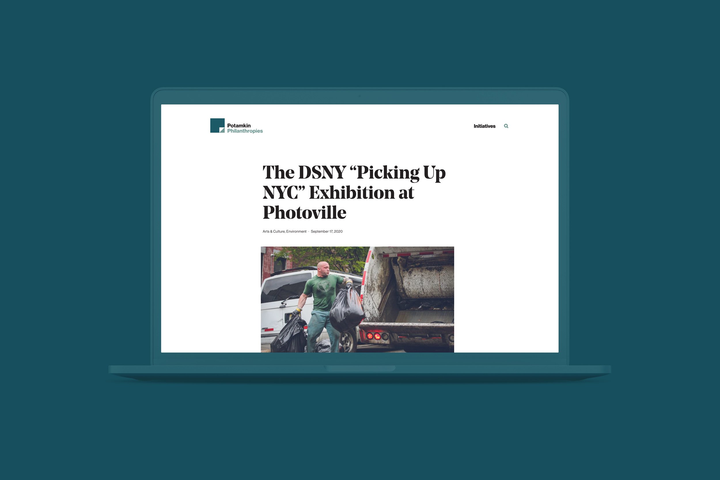
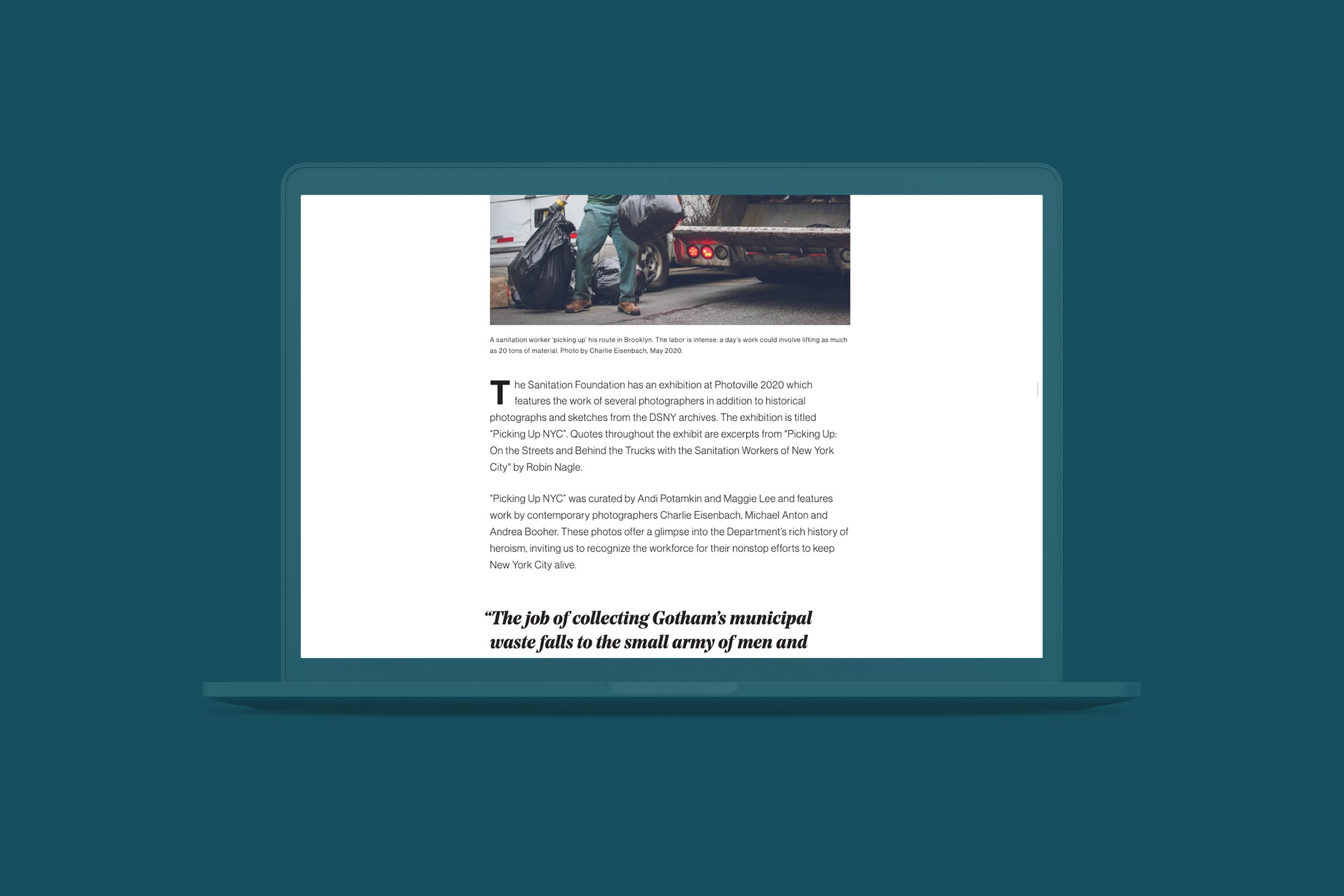
Potamkin.org represents many of the philanthropic initiatives that the Potamkin family has undertaken both past and present. Family members focus their efforts on different ares, different areas devoting their energy, time and support.
The Potamkin Prize, their largest and longest philanthropic effort, is included on the site only in brief since The Prize also has its own website.
potamkin Philanthropies STATIONeRY
concept, design, print management
Business cards, printed and digital letterhead, envelope, and email signatures featuring Potamkin Philanthropies branding are simple and straightforward as part of a larger system of various Potamkin-branded print and digital collateral.
Working within that system, each individual brand stands on its own while also serving a larger communication goal under the Potamkin family name — familiar branding across media and across companies.

Potamkin Companies Identity
brand positioning strategy, naming, concept, design
Potamkin Companies is the parent company for all existing and future Potamkin entities including Potamkin Philanthropies, The Potamkin Prize, and Potamkin Development.
Utilizing the typography present in all Potamkin branding, the Potamkin Companies logotype introduces a visual strategy where all other identities can have their unique voice within the visual system.
The potamkin Companies stationery
concept, design, print management
Business cards, printed and digital letterhead, envelope, and email signatures featuring Potamkin Companies branding are direct, definitive and forthright as the parent company.
As a whole, these bring together the individual entity’s core values and strengths. The system completes their larger communication goal under the Potamkin family name — familiar branding across media and across companies.